
Use
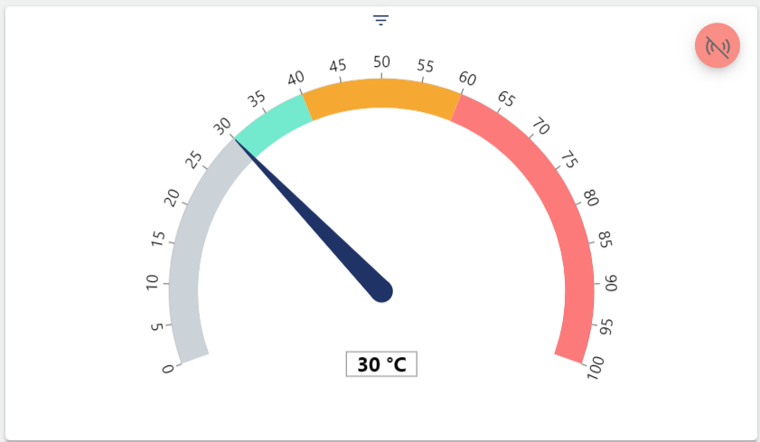
The Measuring Instrument visualizes analog input and output signals in the form of a tachometer with areas that can be configured in different colors. The red live mode icon in the upper right corner indicates that the widget is in livemode and working correctly.
Configuration
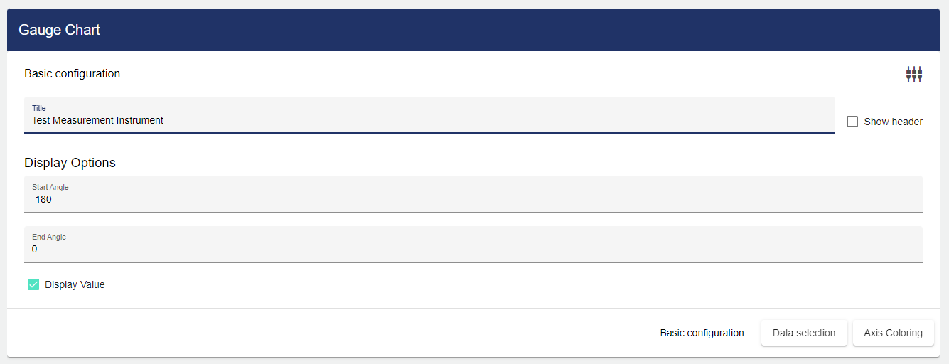
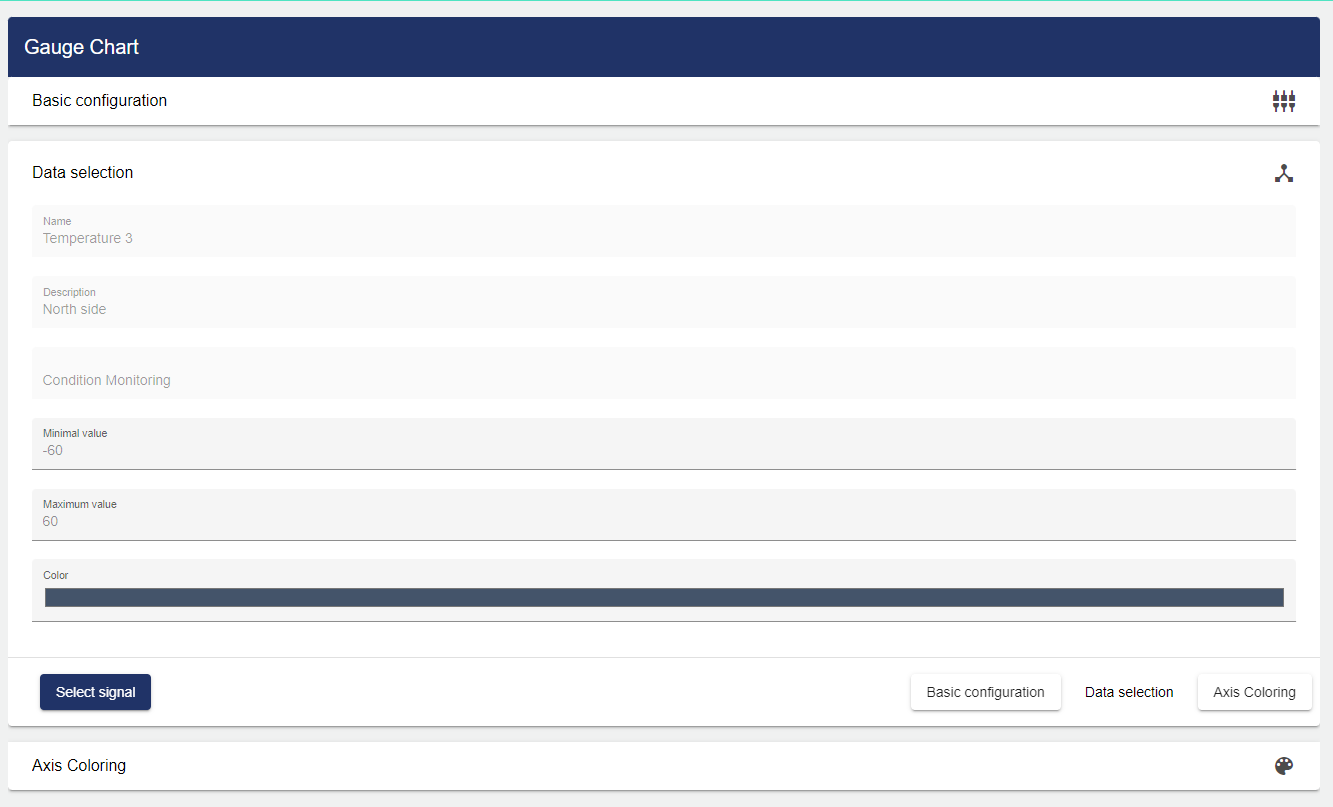
Select the Measuring Instrument widget from the Signals category. In the Basic Configuration of the Measuring Instrument, assign a suitable label (title). The header can be displayed by selecting the check box. You can specify a start or end angle under the "Display options". If the "Display Value" field is activated, the value is also displayed as a number.
Then go to the "Data Selection" tab and click "Signal".
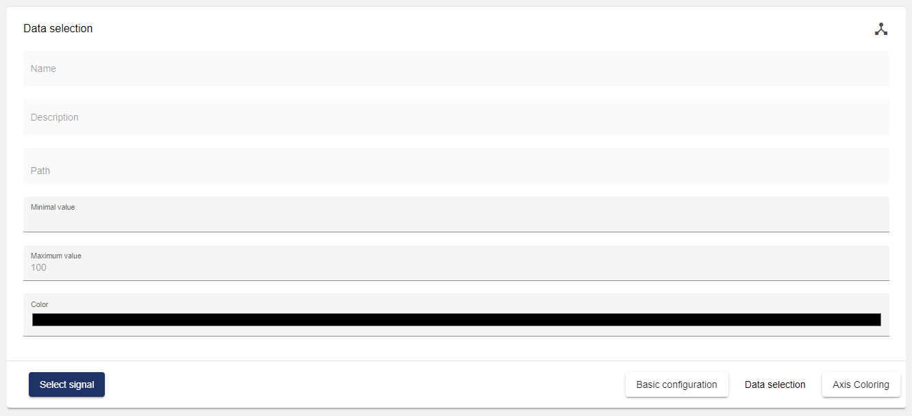
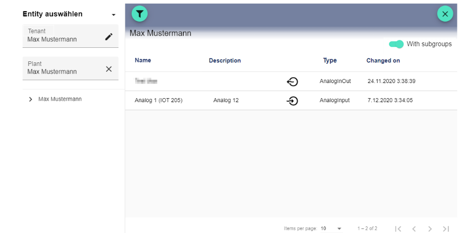
Clicking the Plus button opens the Select Entity window. You can add a previously created signal here.
After selecting the signal, you can choose any color for the pointer and the value under "Color" (in the example above, this color is "red").
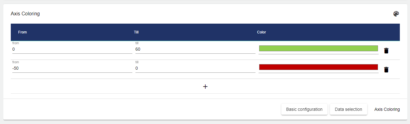
Under the "Axis coloring" tab, certain areas of the axis can be colored differently. The "From" and "To" fields are used to limit the range to be colored. The "Color" field allows you to select and choose the appropriate color.
Once you are satisfied with your configuration, you can save it.