
Widget: XY-Chart
Use
The Time Variation Chart presents a historical view of selected analog or digital data records. Optionally, a livemode can also be activated. Likewise, two time ranges can be compared with each other.
The XY-chart can display historical data and live data.
 | Activation of the livemode. Then max. the last 24 h are displayed incl. current live data. |
|---|---|
 | Refreshes the historical view without performing a browser refresh. |
 | Open the “time control” area to analyse different time frames. |
Analog values as a line chart | Analog values as a bar chart | Digital values as a line chart |
|---|---|---|
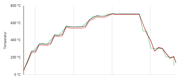 | 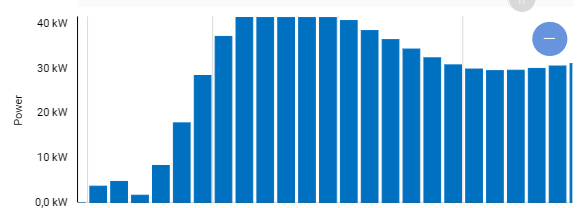 |  |
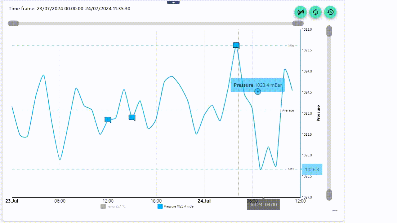
Evaluation of a Historical Record
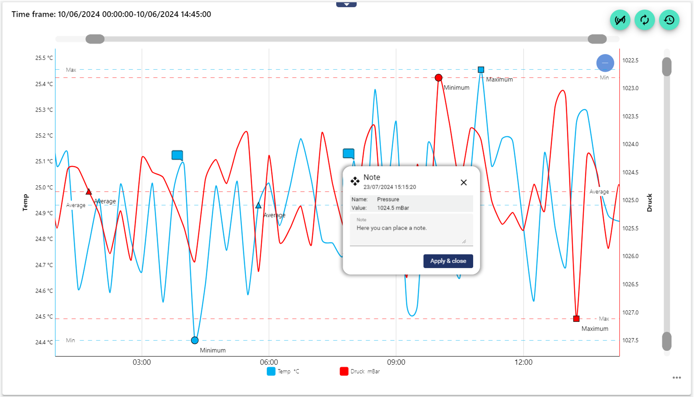
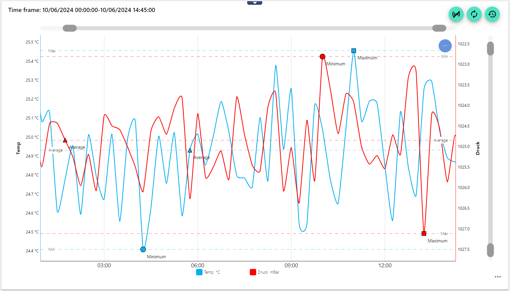
Here is an example of an evaluation of 5 days.
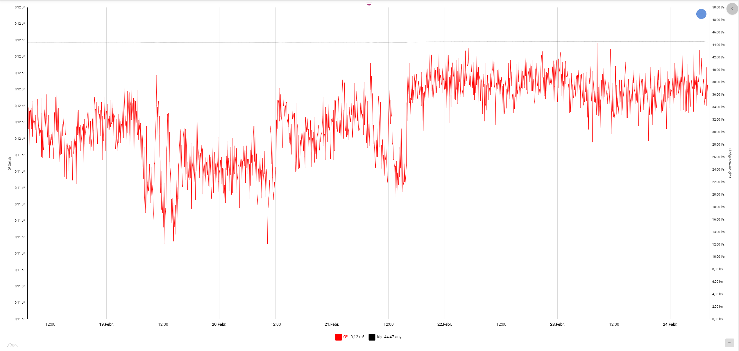
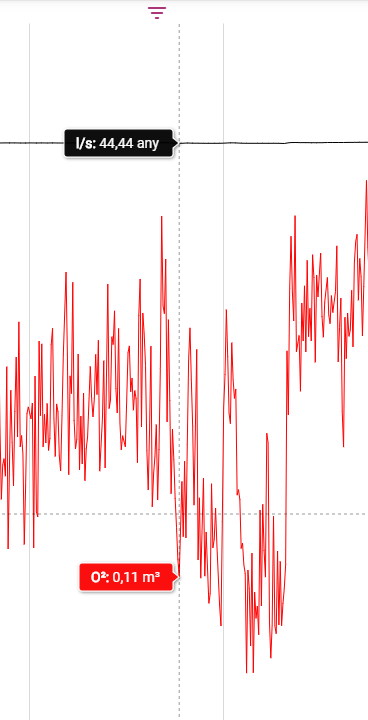
Specific data from a certain point in time is displayed when you hover the mouse cursor over a certain point.
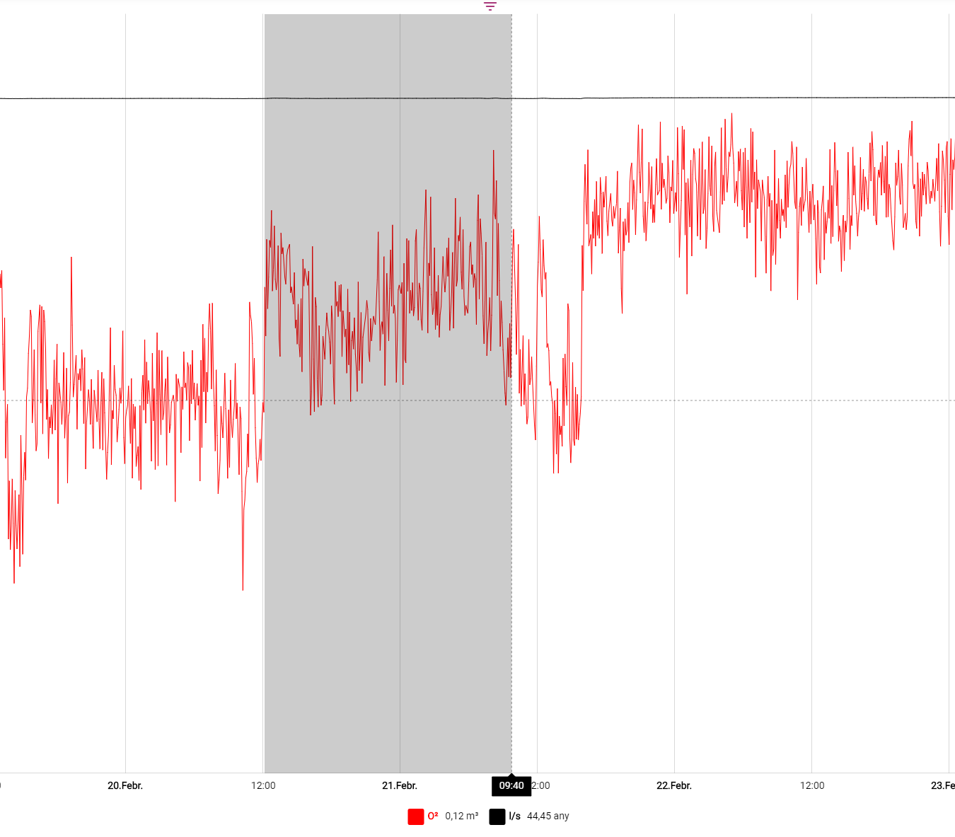
By clicking and holding the mouse cursor on a selected point of the chart, you can highlight an area to zoom in on it.
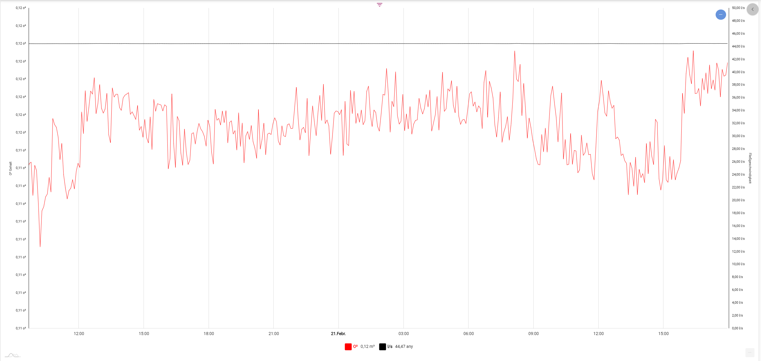
When zooming in, a box with a minus symbol is displayed in the upper right corner of the chart. Clicking the symbol takes you back to the general overview.

The gray slider bar can also be used to view the time range of the chart in more detail. The blue circle in the upper right corner with the white line in the middle can be used to restore the original view.
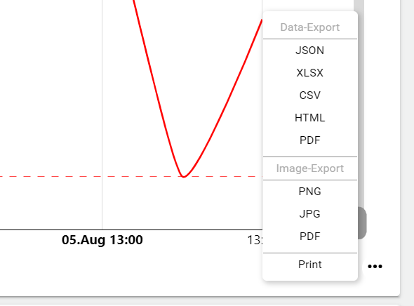
Data export
In the lower right area, you can export the data in any format and save it locally on your hard disk, or evaluate it further.
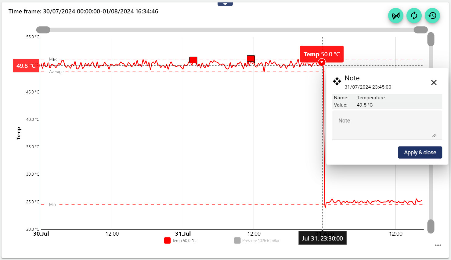
Annotations
Annotations can be entered directly in the diagram. To do this, simply click on the arrow below the tooltip. These annotations are saved permanently and listed in the Widget: Manuel Data as a comment and in the audit log.
Annotations are currently only possible in the process interval.
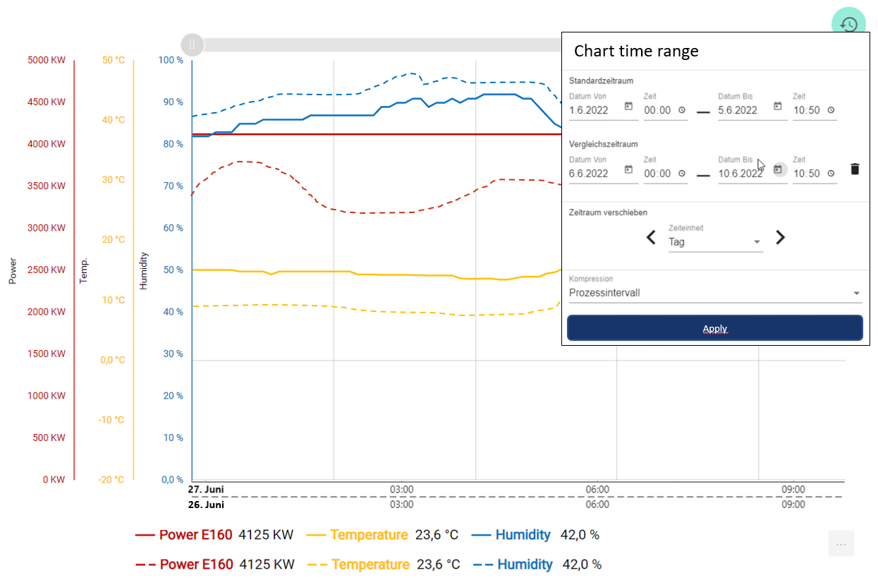
Select time range
If you click one of the lower elements, you receive only the view of this signal in the diagram. All others are hidden.

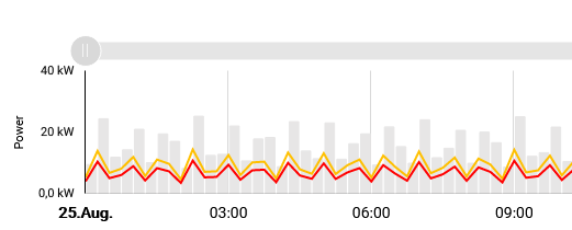
In the upper right corner of the widget there is an icon with the function to select past time ranges and display them in the widget. In the historical view, you can also select the Compression Type to get an optimized display. There is also the option to select a comparison period. Then the past process value curves are displayed dashed.
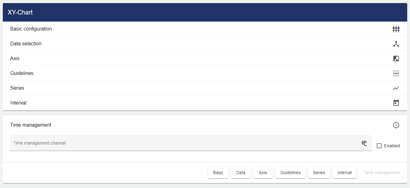
Configuration
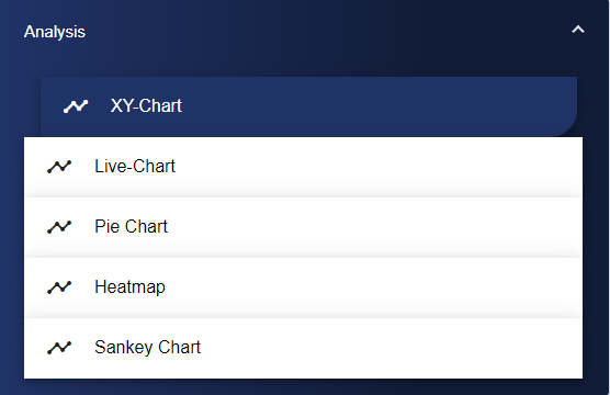
Select the Time Variation Chart widget in the "Analysis" category.
Basic configuration
Assign a suitable title in the Basic Configuration of the Time Variation Chart. The header can be displayed by selecting the check box.
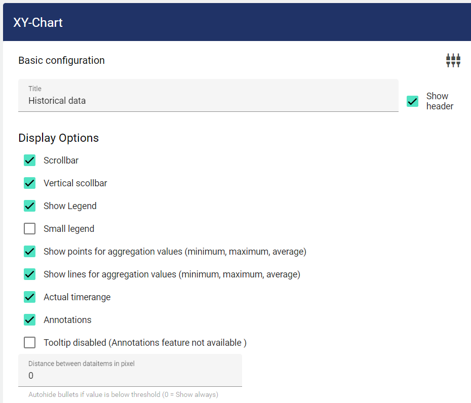
The display options provide the following choices:
Scroll bar: The gray bar above the diagram can be used to enlarge a specific area horizontally by clicking on it.
Vertical scroll bar: The gray bar on the side of the diagram can be used to enlarge a specific vertical area by clicking on it.
Show legends: The legend is displayed below the diagram.
Small legend: If narrow legend is activated, the box is displayed in series in the specified thickness; if it is deactivated, the box is displayed in the standard size. The symbols then do not adapt to the line thickness.
Show points for aggregation values (minimum, maximum, average): This is used to display symbols within the diagram that better identify the corresponding values.
Show lines for aggregation values (minimum, maximum, average): This is used to display lines within the diagram that better identify the corresponding values.
Actual time range: This also shows the time range that is viewed in the diagram using Zoom.
Annotations: This determines whether annotations can be set in the diagram or not.
Tooltip/balloon deactivated (Annotations feature not available): This deactivates the pop-up window that appears as soon as you hover over an area with the mouse. Annotations are not available as well.
Distance between data items in pixels: This refers to the annotations function. The number entered here determines the zoom level from which the comment icons are hidden.
Data selection
Then click on the "Data selection" tab to add the signals you want to display.
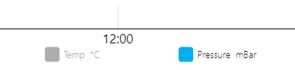
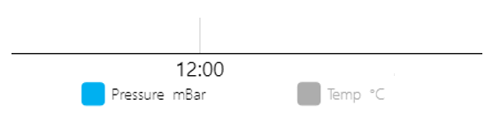
The order of the individual signals in the legend can be changed. To do this, simply move the position of the signals in the "Data selection" tab using drag and drop.
Sequence A | Sequence B |
|---|---|
 |  |
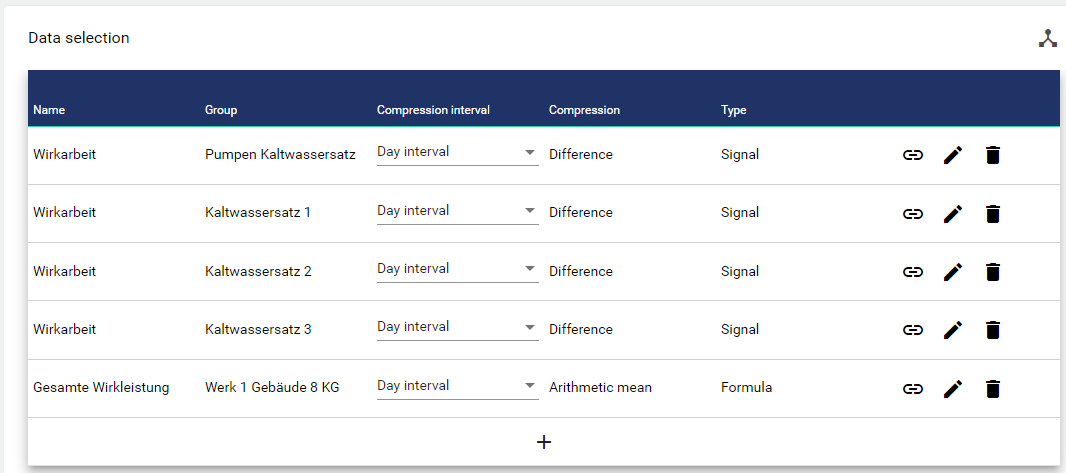
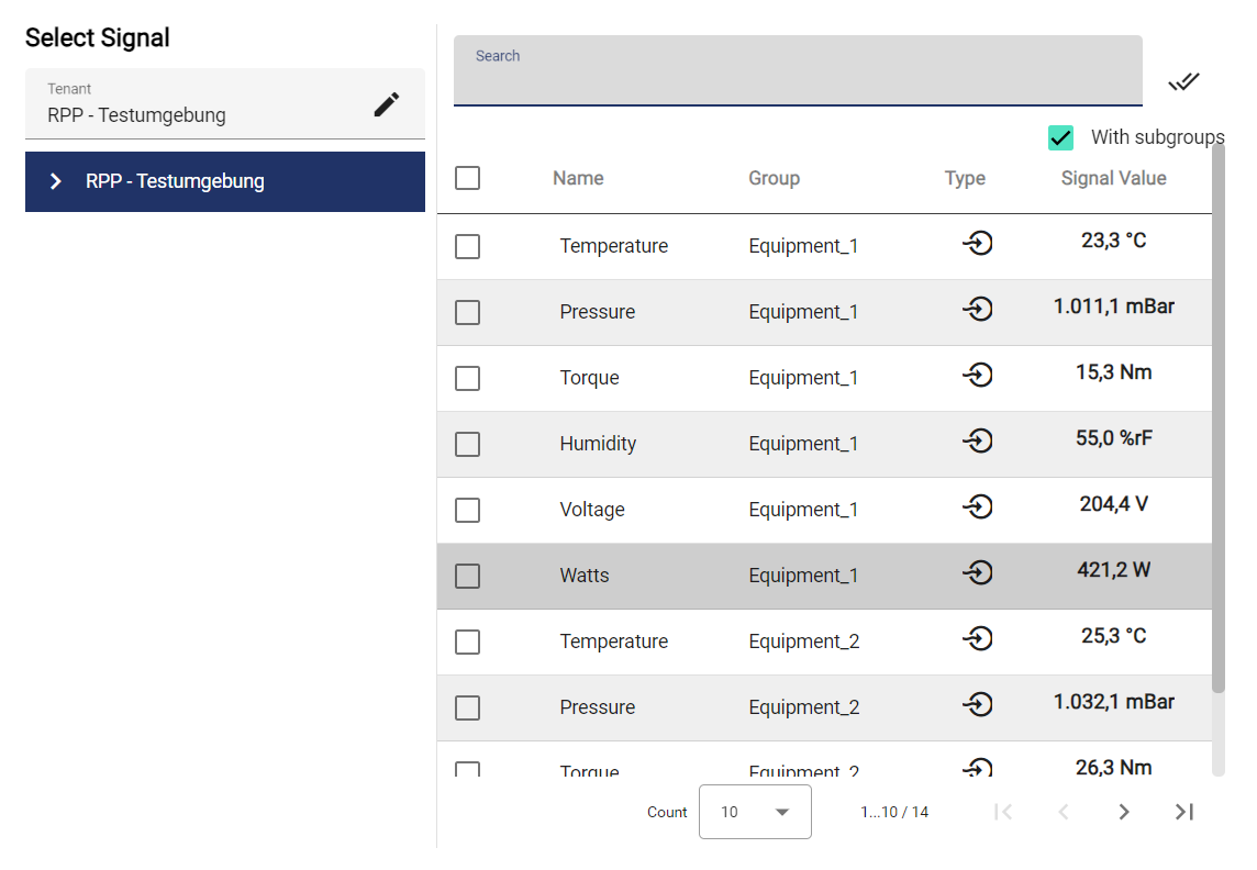
Clicking the Plus button opens the Select Entity window. You can add signals that were created earlier. The checkboxes can be used to mark multiple signals and select them all simultaneously.
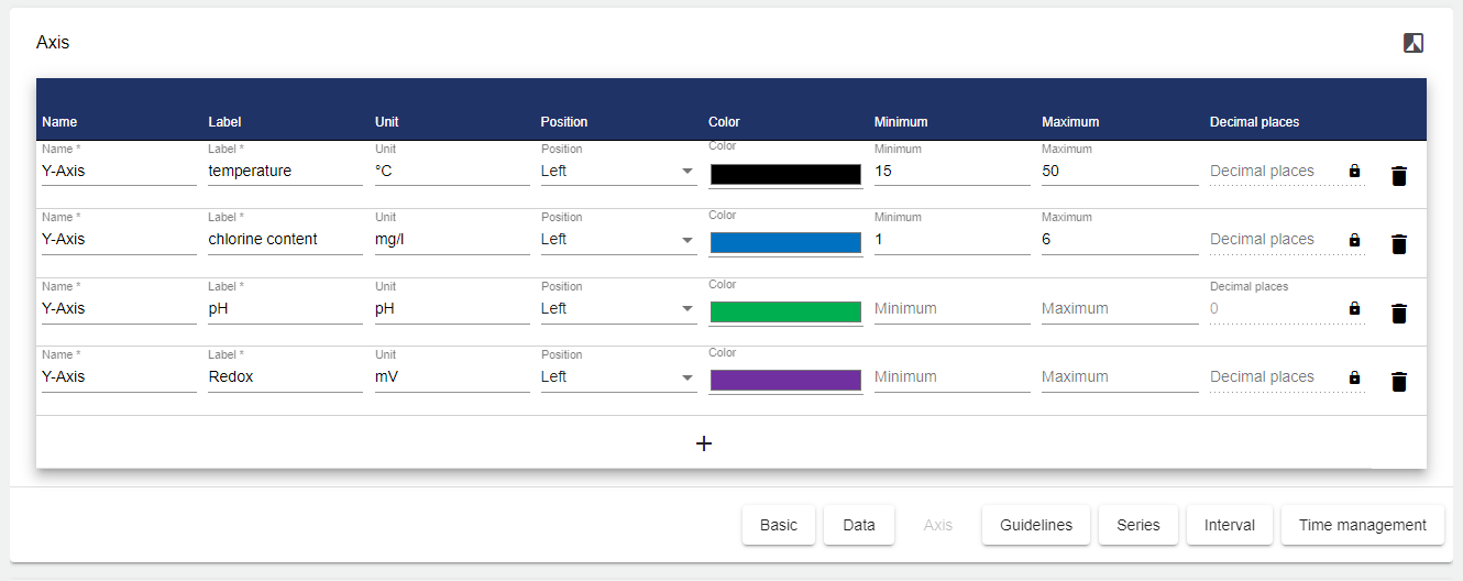
Axis
Then click the "Axis" tab to define your axis label. You need to specify the name and label for the axes. The unit, position, color, minimum, maximum value and decimal places can be used if required. If you do not set the decimal places, the highest value from the "Series" (see below) is applied.
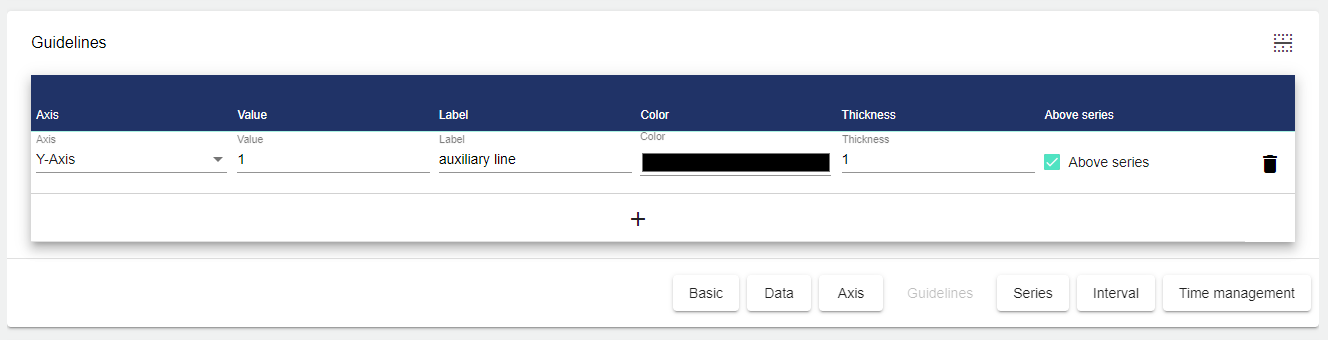
Guidlines
Guide lines can be added in the next field. Here you need to select the axis for which you want to create the guide line. The value defines where the guide line is displayed. Labeling is optional. You can also select any color and the thickness of the line. The "Above series" checkmark indicates whether the guide line is visible in the layer above the chart or displayed in the background behind the chart.
Series
A series is automatically created for all selected data points. A suitable axis must be assigned for each signal. You can also specify the label, line type and color, as well as the line thickness and the decimal places in the chart.
Type of series:
Line series | Graphical representation of the values with individual lines. The connection of the points is done in a direct way. | 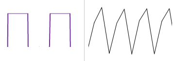 digital signal I analog signal |
|---|---|---|
Curved lineseries | Graphical representation of the values with individual lines. The connection of the points is rounded and not direct. | 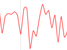 |
Step line series | Graphical representation of the values in steps. A continuous line shows the high and low points as deflections up/down. | 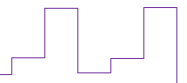 |
Step series | Exactly like the step line series, except that the area under the line is colored. (Well suited for digital signals) | 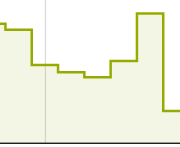 |
Column series | Graphical representation of the values in the form of columns |  |
If you do not set the decimal places under "Series", the value entered in the Signal Configuration is applied.
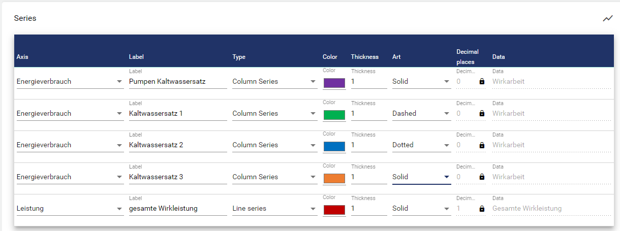
The series range can be extended to the right using a horizontal scrollbar. Corresponding selections for min, max and average values (axis ranges, auxiliary lines, data points) can be defined for each signal here.
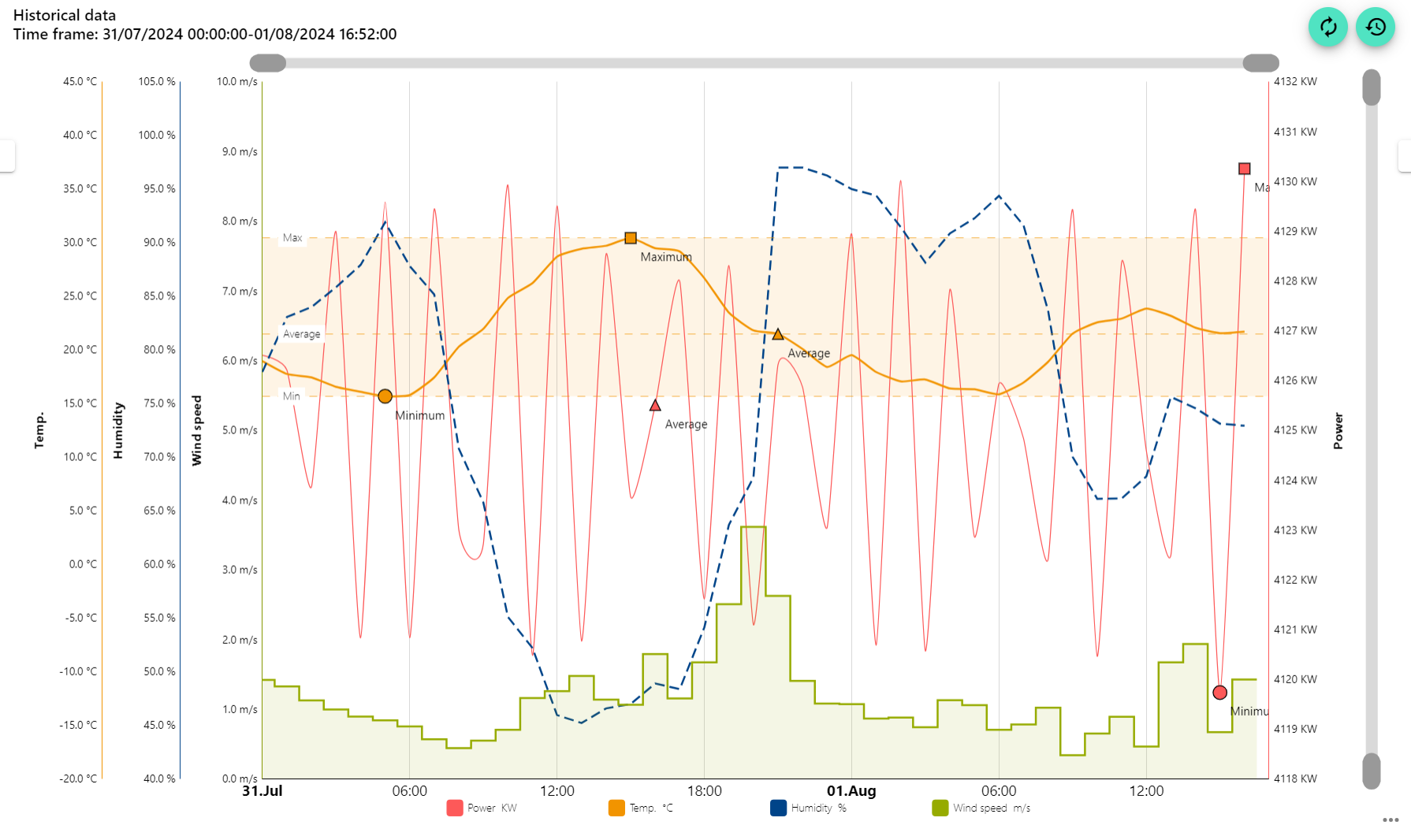
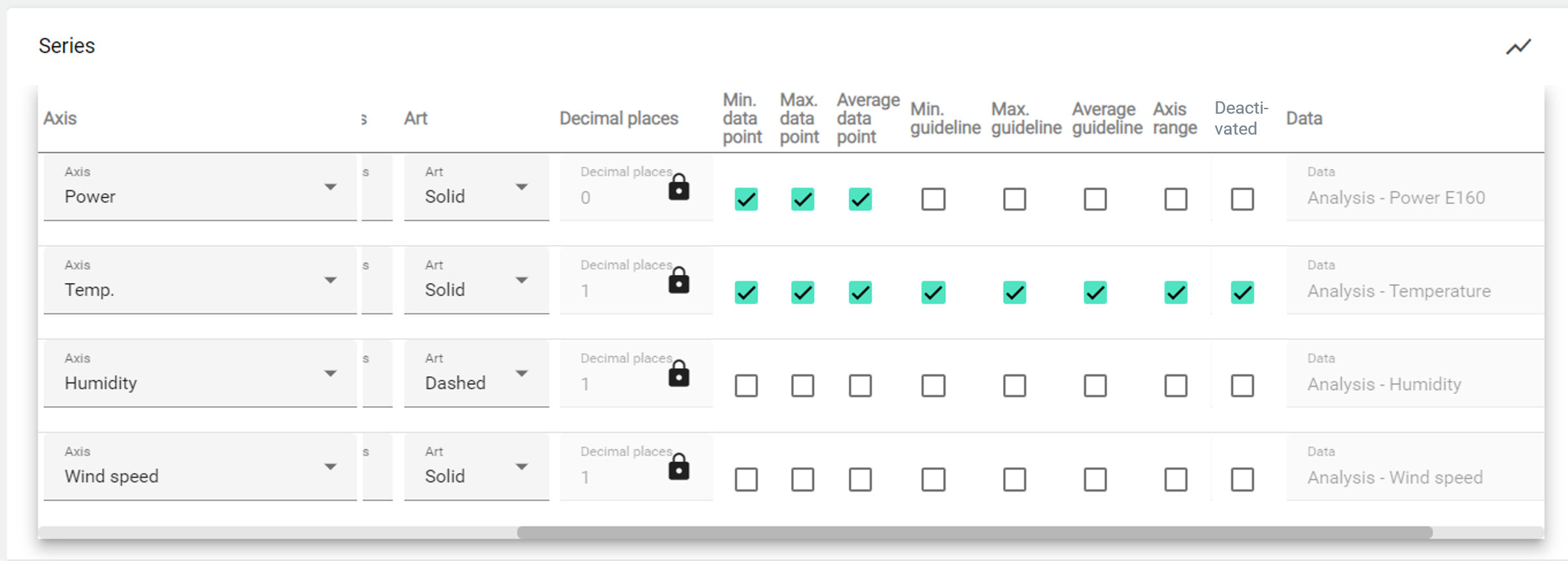
The "Deactivate" item can be used to set whether or not the graph is displayed as active by default. In the example below, the temperature is deselected. It can be activated at any time with a click.
Intervall
You can now set the interval of the data to be displayed. To do this, click the "Interval" tab. The smallest possible time unit here is 1 day.

Set the time period for the display.
To display the data for one or more days, set the time frame to Day; the period number defines how many days in the past should be displayed. The same applies to any other time frame setting (week, month, quarter, year)!
You must specify when the recording is to start and the period after which it is to end. To do this, specify the day of the week and the time in each case.
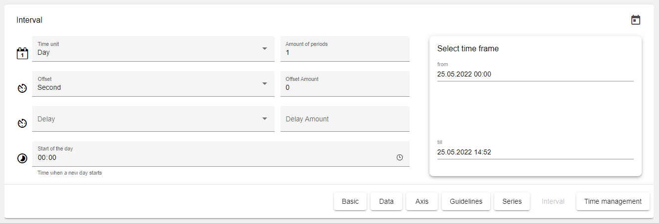
 | Basic setting for the length of the interval. |
 | This setting can be used to define the length of the time frame. Value of this input x interval size = time frame |
 | Offset. This setting can be used to specify an offset for the time frame. Both into the past and into the future. |
 | This setting can be used to specify the start of the day on an individual basis. |
 | This setting can be used to specify a particular day of the week as the start. (Only appears if "Week" was selected for the interval) |
Time management
In the "Time Management" tab, you can specify different labels under "Channel" and use them to link multiple analysis widgets. This function is used, for example, if a viewer wants to see signal values at 9 am in all widgets of the Dashboard tab at the same time.
Finally, you can set a channel under the "Time Management" tab. First you need to assign a channel name. This channel name must be unique. The channel is used to link multiple charts on the Dashboard. This channel name can then be assigned in multiple analysis widgets. By assigning the same channel to different analysis widgets, the time periods of the different analysis widgets can be controlled simultaneously.
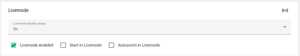
Livemodus
If live mode is activated, an icon appears in the widget with which it can be used in the widget. Only the "Display period" (1h-24h) with historical values is then displayed, and the live values of the IoT device also appear.
If the widget is to start in live mode, this setting can also be checked. There is then an option to deactivate this in the widget.
Once you are happy with your configuration, you can save it.