
Widget: Heatmap
Use
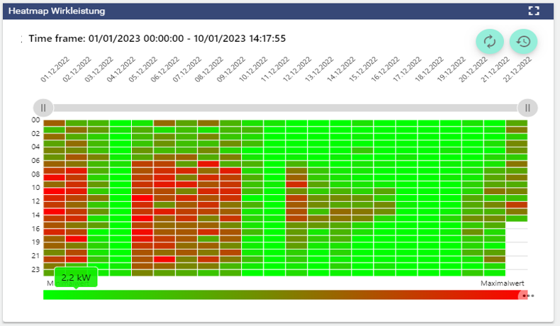
The Heatmap chart is a graphical, color representation of values. By setting minimum and maximum values, areas are highlighted in color. This allows values from a large amount of data to be displayed in an easily recognizable way. The Heatmap is mainly used in the energy industry in the context of the ISO 50.001 Standard. It represents 24 average signal values per day.
 | Refreshes the historical view without performing a browser refresh. |
|---|---|
 | Open the “time control” area to analyse different time frames. |
Configuration
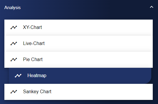
Select the Heatmap widget in the Analysis category.
In the Basic Configuration of the Heatmap, assign a suitable title. The header can be displayed by selecting the check box. Optionally, you can select a decimal place and a unit.
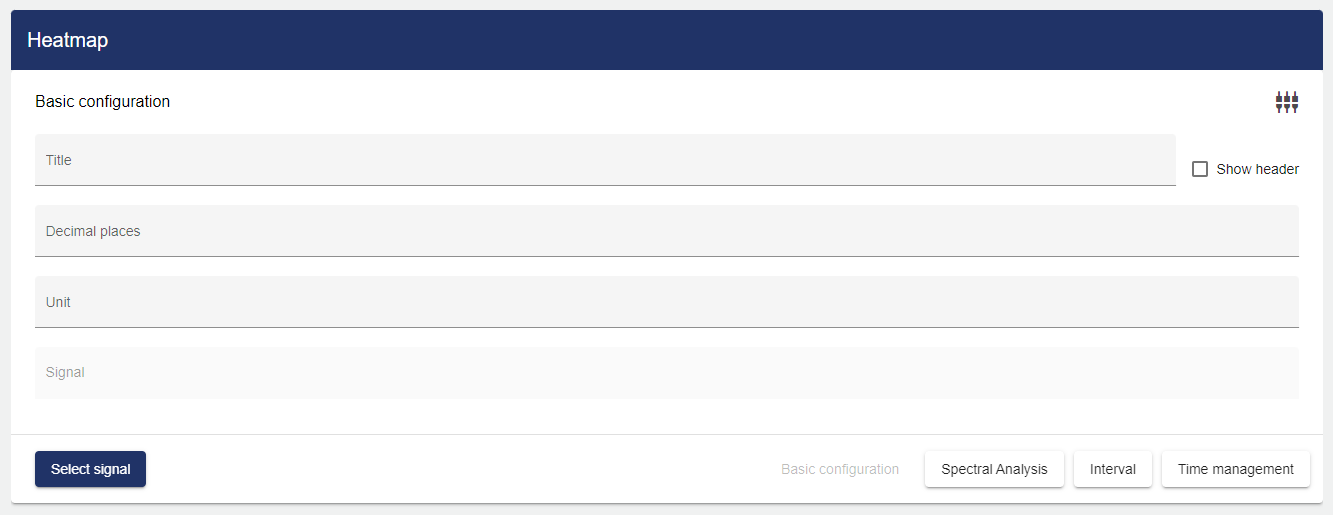
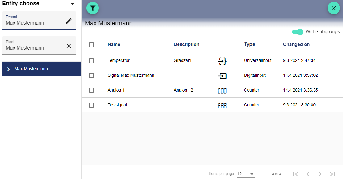
Clicking "Select Signal" opens the Select Entity window. You can add signals that were created earlier.
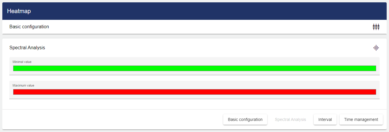
Via the "Spectral Analysis" tab, select a color for the minimum and maximum values.
Then you only have to set the interval of the data to be displayed.
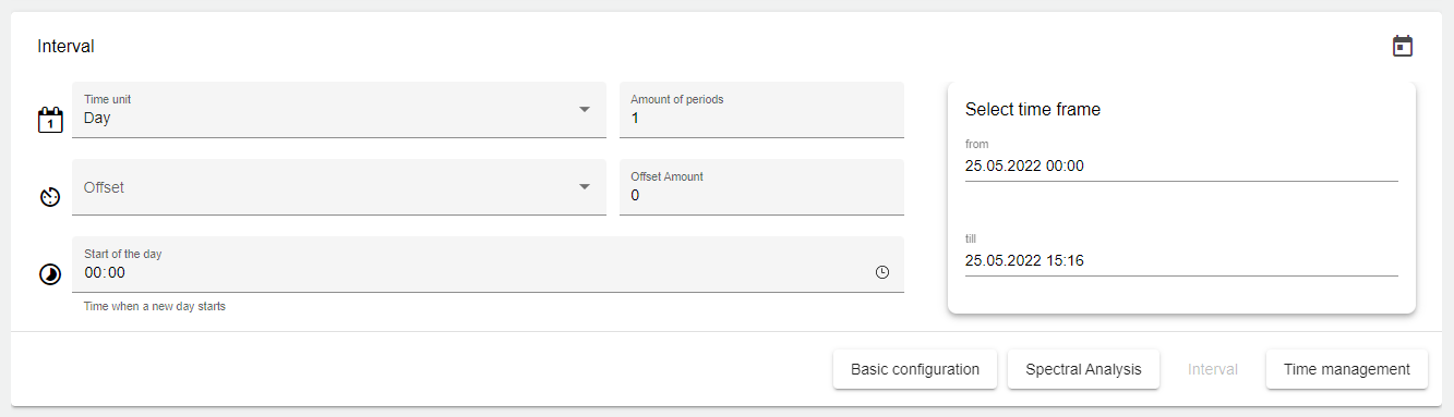
Set the time period for the display.
To display the data for one or more days, set the time frame to Day; the period number defines how many days in the past should be displayed. The same applies to any other time frame setting (week, month, quarter, year)!

| Basic setting for the length of the interval. |

| This setting can be used to change the starting point of the time frame. |

| Offset. This setting can be used to specify an offset for the time frame. Both into the past and into the future. |

| This setting can be used to specify the start of the day on an individual basis. |
 | This setting can be used to specify a particular day of the week as the start. (Only appears if "Week" was selected for the interval) |
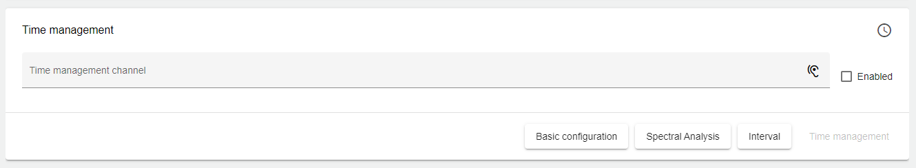
In the "Time Management" tab, you can specify different labels under "Channel" and use them to link multiple analysis widgets. This function is used, for example, if a viewer wants to see signal values at 9 am in all widgets of the Dashboard tab at the same time.
Finally, you can set a channel under the "Time Management" tab. First you need to assign a channel name. This channel name must be unique. The channel is used to link multiple charts on the Dashboard. This channel name can now be entered in multiple analysis widgets. By entering the same channel for different analysis widgets, the time periods of the different analysis widgets can be controlled simultaneously via the Dashboard.
Once you are satisfied with your configuration, you can save it.