
Widget: Gauge Chart
Use
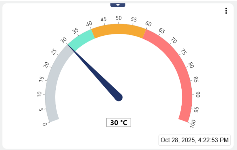
The Widget: Gauge Chart visualizes analog input and output signals in the form of a tachometer with areas that can be configured in different colors.
The three dots in the upper right corner ![]() can be used to call up the following detailed information about the signal:
can be used to call up the following detailed information about the signal:
 | Can be set via "Manage conditions" (see below). Allows to edit the conditions (Alarm thresholds) set in the signal. |
|---|---|
 | Can be set via "Include signal history" (see below). Allows you to view in list form when which historical values were stored in the system. |
 | Can be set via "Include signal history" (see below). Allows you to view the historical values of the signal via chart . |
Configuration
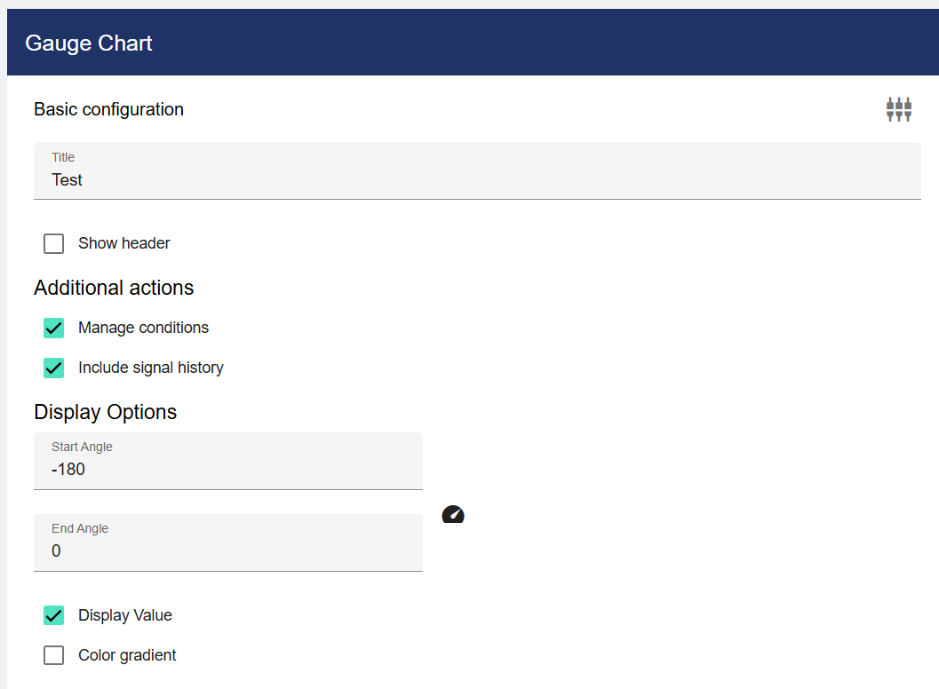
Select the Measuring Instrument widget from the Signals category. In the Basic Configuration of the Measuring Instrument, assign a suitable label (title). The header can be displayed by selecting the check box. You can specify a start or end angle under the "Display options".
If the “Display Value” field is activated, the value is also displayed as a number. As described above, you can set here whether the conditions and the signal history should be displayed. You can also set the angle, whether the values should be displayed on the scale, and whether there should be a color gradient.
Then go to the "Data Selection" tab and click "Signal".
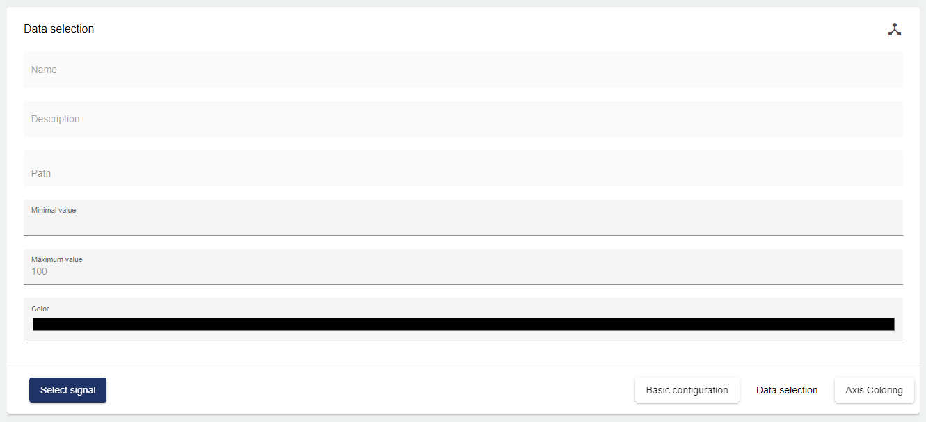
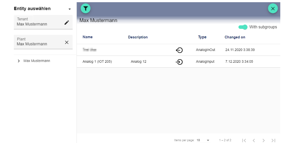
Clicking the Plus button opens the Select Entity window. You can add a previously created signal here.
After selecting the signal, you can choose any color for the pointer and the value under "Color" (in the example above, this color is "red").
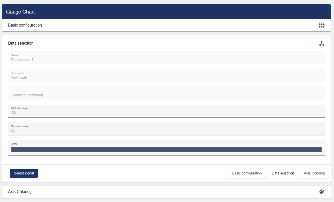
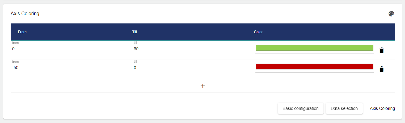
Under the "Axis coloring" tab, certain areas of the axis can be colored differently. The "From" and "To" fields are used to limit the range to be colored. The "Color" field allows you to select and choose the appropriate color.
Once you are satisfied with your configuration, you can save it.